My Etsy shop is now a little more stocked! If you like dragon egg vases, or whimsical dragons, or pots with swirls, then do go check it out. You can follow this link: www.etsy.com/shop/RiverdragonCeramics. Or, anytime you visit my blog, you can click on the link over on the upper right corner where images of some of the work in my shop appear.
Happy New Year!
Monday, December 31, 2012
Monday, December 24, 2012
More translucent porcelain from this firing
I was very pleased with the number of pieces that came out translucent in this firing. This was my first adventure using translucent porcelain, and to my delight, I have found that it does not need to be as thin as I thought to produce this effect. Here are three more pictures of my first efforts.

The little piece above is a tiny vase about 2 inches tall. In the picture it is lying on its side with a flashlight inside of it. This is probably the most flattering picture possible of this poor little piece; it had two major glaze problems and thus doesn't look very good in the daylight. But it's translucent! Isn't that glow neat? (The glaze inside crawled all over to one side, and another pot that was glazed too thickly plopped a droplet of brown glaze on it, for those who want all the gory details.)
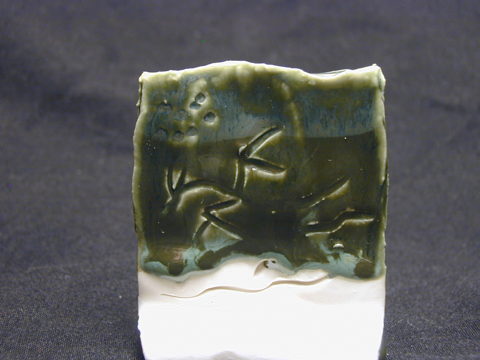
This piece is thin for sure, but it's not so thin that I couldn't make something else like it. It was thick enough to carve those wavy lines on.

Cthulu fhtagn! This cup also had a glaze fault, which is a shame because it has a cuttlefish on it that I was rather fond of. The cuttlefish does glow with a light behind it, as you can see in the picture above. This cup is not as thin as the tiny vase above, and I thought for sure it would not be translucent. Looks like I was wrong! This is good news. It means future cuttlefish cups will also be translucent, so those of you who have been excited about cuttlefish can get a little more excited! (If you're wondering why the picture looks odd, I flipped it upside down so the cuttlefish is a little easier to parse out. The cup was sitting on its rim for the photo shoot like the one below.)

The cup above recently appeared in my Etsy shop, where there are also pictures of it in normal light. It is glazed with clear glaze, and on the outside has a bit of green in the textured area. I really like being able to make translucent cups without even doing anything special! It's a treat to be able to just make them thin and light like I usually do and have this result when they are finished.
I will be continuing to use this porcelain (Laguna #15). It is easy to work with, and how can I complain about the results I'm getting?

The little piece above is a tiny vase about 2 inches tall. In the picture it is lying on its side with a flashlight inside of it. This is probably the most flattering picture possible of this poor little piece; it had two major glaze problems and thus doesn't look very good in the daylight. But it's translucent! Isn't that glow neat? (The glaze inside crawled all over to one side, and another pot that was glazed too thickly plopped a droplet of brown glaze on it, for those who want all the gory details.)
This piece is thin for sure, but it's not so thin that I couldn't make something else like it. It was thick enough to carve those wavy lines on.

Cthulu fhtagn! This cup also had a glaze fault, which is a shame because it has a cuttlefish on it that I was rather fond of. The cuttlefish does glow with a light behind it, as you can see in the picture above. This cup is not as thin as the tiny vase above, and I thought for sure it would not be translucent. Looks like I was wrong! This is good news. It means future cuttlefish cups will also be translucent, so those of you who have been excited about cuttlefish can get a little more excited! (If you're wondering why the picture looks odd, I flipped it upside down so the cuttlefish is a little easier to parse out. The cup was sitting on its rim for the photo shoot like the one below.)

The cup above recently appeared in my Etsy shop, where there are also pictures of it in normal light. It is glazed with clear glaze, and on the outside has a bit of green in the textured area. I really like being able to make translucent cups without even doing anything special! It's a treat to be able to just make them thin and light like I usually do and have this result when they are finished.
I will be continuing to use this porcelain (Laguna #15). It is easy to work with, and how can I complain about the results I'm getting?
Friday, December 21, 2012
Friday Critique: Swirl plate
This week's Friday Critique is of a swirl plate that just came out of the kiln last weekend. This plate is 8 inches in diameter and 1.75 inches in height. It is made of porcelain (Laguna #15 for those who are interested), and was fired to cone 6 in oxidation in an electric kiln. It was glazed with Mottled Spice (the brown glaze) and Deep Firebrick (the red glaze).
For the most part, I will talk about glazing in this week's post, but feel free to comment on any aspect of the piece. Click on the pictures to view them in a larger size.
.JPG)
.JPG)

.JPG)


.JPG)
.JPG)

.JPG)
This plate was a little bit of an experiment in terms of the glazing. I was not certain these two glazes would work together, but I think that the red is visible enough against the brown without being jarring. I was also not certain how the brush marks would appear, or whether they would be distracting. I think that they add depth and texture to the surface in a pleasing way. I do not think they detract from the swirl. The swirl interrupts the brush marks with its contrasting, smoother texture, and I think it makes the piece more interesting.
.JPG)
I find that the foot in its stark whiteness is distracting, however. It is so snowy and smooth compared to the earthy body of the pot. I'm considering glazing the next piece in this style all the way down to the edge of the foot so that the only place the porcelain is visible is the very bottom of the foot.
.JPG)
.JPG)
.JPG)
.JPG)
The brown glaze was applied with a brush, which produced the uneven coloration. The surface of the plate was not textured before glazing. The glaze is very shiny, which caused this piece to be difficult to photograph accurately.

The foot was made wide so that the plate would be stable when used to eat off of.
.JPG)
The foot and the rim were made smooth to echo each other.


.JPG)
.JPG)

.JPG)
This plate was a little bit of an experiment in terms of the glazing. I was not certain these two glazes would work together, but I think that the red is visible enough against the brown without being jarring. I was also not certain how the brush marks would appear, or whether they would be distracting. I think that they add depth and texture to the surface in a pleasing way. I do not think they detract from the swirl. The swirl interrupts the brush marks with its contrasting, smoother texture, and I think it makes the piece more interesting.
.JPG)
I find that the foot in its stark whiteness is distracting, however. It is so snowy and smooth compared to the earthy body of the pot. I'm considering glazing the next piece in this style all the way down to the edge of the foot so that the only place the porcelain is visible is the very bottom of the foot.
.JPG)
.JPG)
I do think I will make more pots with this glazing scheme. Now that I have a red glaze that seems reliable, I plan to use it. Red is a useful color; it is bright and warm and contrasts with most other colors. I feel lucky to have found one that performs well with my first try. It is often an elusive color.
What do you think, readers? Would a dinnerware set in these colors be attractive and enjoyable to use? Does the bright porcelain foot bother you as much as it bothers me?
Edited to add: Here is a picture that shows the glossy surface a little more.
.JPG)
Edited to add: Here is a picture that shows the glossy surface a little more.
.JPG)
Thursday, December 20, 2012
What cones are and what they do
In essence, cones are a way of labeling a certain amount of "melted-ness" of ceramic materials. Pyrometric cones are specially formulated from glassy materials to melt at a certain point based on time and temperature - thus they melt similarly to the way that other ceramic materials do in the kiln.

These are cones that have not been fired yet. From left to right, they are cone 5, cone 6, and cone 7. These are the cones I use in a glaze firing.

Cones are numbered from cone 022 (coolest) to cone 15 (hottest). (Actually they do go hotter, but no studio potter would use the upper limits beyond cone 13 or so.) Cone 6 and Cone 10 (most often used) are around 2232 F and 2350 F respectively. So anytime I say something is fired to cone 6, I'm saying I fired it to around 2232 F, but with pyrometric cones to measure the heat work. Saying "cone 6" is more accurate than the temperature for the purpose of knowing how the clay and glazes will react.
Here is an example. In the picture below, you see two cone packs, both with cones 5, 6, and 7 (from left to right). The one on the left was in the first test firing of my new kiln, and the one on the right was in the kiln during the latest firing.

The cone pack on the left shows a kiln that has fired to cone 7, and the one on the right shows a kiln that has fired to about cone 5 1/2. You can tell because the cone 7 on the left cone pack has curled over to about halfway, and the cone 6 on the right cone pack is nearly, but not quite, to halfway while the cone 5 in that cone pack is very floppy.
Now, what was the difference in temperature here? Cone 6 is "supposed" to be 2232 degrees Fahrenheit. The kiln fired to 2236 F in the firing represented on the left, yet it shows as cone 7. This is because of the heat work I mentioned above - the firing schedule must have been slow enough near the peak temperature to produce more heat work, and thus the cone 7 began to bend despite the actual temperature. According to the kiln, this was a perfect firing. According to the cones, the kiln overfired. The cones are right. If the test tiles from this post had been in that firing, the glazes would have been even runnier.
So what did I change for the next firing? I fired to a peak temperature of 2180 F rather than 2236 F. 2180 F is within the range of cone 5. I also programmed the kiln with a slower rate of climb near the end of the firing, and a fifteen minute hold at peak temperature. These adjustments resulted in the cones that you see on the right. As far as I'm concerned, this was a perfect firing. The cones are right where I want them, because the glazes and clays I use are formulated for cones 5 - 6.
Pyrometers are super devices, and they can be helpful during firings. But cones are the best way to judge the heatwork during and after a firing. You can fire a kiln without a pyrometer, but it is very hard to do without cones. I have the luxury of a programmable kiln, so I can theoretically just tell it what to do and leave it alone. But the cones offer me an extra diagnostic tool, not just to know when something goes wrong, but also to know when things are going well, and to give me the option to observe the end of the firing and shut off the kiln at just the right time if I so choose.
Wednesday, December 19, 2012
Happy anniversary, blog!
I just realized that I started this blog one year ago today! I started this blog when I had only just finished my senior thesis at Simon's Rock. I didn't know I would be starting a business yet, but I knew I wanted to present my work and my ideas to a wider audience using the internet.
It has been an exciting year. I think on the whole it has been very good, and I'm looking forward to the next year of blogging about my new business and ceramics adventures. Thank you for reading!
It has been an exciting year. I think on the whole it has been very good, and I'm looking forward to the next year of blogging about my new business and ceramics adventures. Thank you for reading!
Wednesday Traveling Dragons
This time we have a couple new stars! This little creature just came out of the kiln this weekend, and is already finding things to be happy about.
.JPG)
.JPG)
.JPG)
.JPG)
And this little one as well:


.JPG)
.JPG)
.JPG)
.JPG)
And this little one as well:


Some test tiles!
I tested four glazes in this firing: Deep Firebrick, Mottled Spice, Verte Lustre, and a zinc-free clear. I would say that all four tests were successful in that I think I now know how to use these glazes to good advantage. They do each have some quirks, though.
.JPG)
.JPG)
The glaze above is Deep Firebrick. It is very red! On that front I am pleased. It is red on both the dark clay and the porcelain, and I actually think it looks more interesting on the dark clay. This glaze was nice to work with - it's formulated for brushing, so that's how I applied it, and it ended up with fairly even thickness despite the brushstrokes. It also seems stiff (doesn't run off the pot during firing). The one thing that I don't like is that it spits during the firing - the porcelain pendants near these tiles were spattered with tiny red dots. It looks a bit like iron spotting, and I don't think it looks bad, but I do think I'll avoid putting bare porcelain next to this glaze in the future.
.JPG)
.JPG)
.JPG)
The glaze above is the Mottled Spice, that brown glaze I've mentioned a few times. Obviously it's a little runny. Other pots that were glazed with this glaze had varying degrees of success depending on how thickly the glaze was applied. Where it was thin (thinner than I would normally glaze pieces, actually) it looks amazing. Where it was thicker, it did what you see on the tiles. I did lose a serving dish to it - I'll have to chisel it off the shelf. However, the surface is so rich and lovely that I'm willing to adjust my application techniques to use it. (Do click on that second picture and see!) I have a bit of experience with runny glazes. There was a glaze at Simon's Rock - an amber celadon - that was a lovely dark honey color. I just had to use that glaze! But it would run right off the pot if it was the thickness of normal glaze, so I learned to apply it thinly and it was amazing.
.JPG)

The glaze above is Verte Lustre. It is difficult to photograph, because as the name implies it is extremely shiny, and also dark colored. I do like it a lot. It has subtle variation wherever the clay underneath isn't perfectly smooth. The information that came with it says that it is dinnerware safe, but if you take a good look at that second image you'll see that it looks different at the top of the tile. That difference was in response to that part of the tile sitting in vinegar for two hours. It's probably not going to kill anybody to eat food off this glaze (how else could it have been certified dinnerware safe?), but if you put anything acidic on it, like tomatoes, or citrus fruit, or salad dressing, or any of the other myriad acidic foods out there, you will see a mark on the glaze where the food was sitting. Thus I will avoid using it on the food surfaces of my pots in the future, and any pots that have this glaze anywhere on them will come with a warning not to put anything acidic on them. I think it will make a very fine glaze for vases and dragons, however.
.JPG)
.JPG)
This is the zinc-free clear. Why zinc free? I've read that zinc tends to inhibit color development, particularly with greens - apparently zinc and chrome don't get along, and chrome is a very common way to achieve green. The purpose of having this glaze is so that I can mix stains and oxides into it to make my own colors. I think it is a lovely clear, maybe the nicest I've ever used. It has a nice depth of surface - caused by the bubbles. The bubbles also are the cause of the milky-ness that appears when the glaze is used over red clay. I could probably make the bubbles go away with different firing procedures, but I like them there. The glaze is very stiff, and a little bit inclined to crawl (pull away from the clay). This isn't really a problem, I'll just have to get used to what makes it crawl and avoid that. It's a characteristic that many glazes have. The one issue that does bother me about this glaze is that it's a pain to apply. The materials settle out quickly. So they make a thick sediment at the bottom of the bucket, and once I've managed to stir it up, by the time the pot is ready to dip it's settled out again. There are some things I can do to help this, so I will try those for the next firing.
Overall I'm pleased with these tests. I think these glazes have a lot of potential, and I look forward to the next glaze firing so that I can do some more work with them.
Does anybody have ideas of different colored or textured glazes you're interested in seeing from me? I haven't shown a matte glaze here yet - I will be getting and testing one for the next firing to make a matte black. I'm open to suggestions!
.JPG)
.JPG)
The glaze above is Deep Firebrick. It is very red! On that front I am pleased. It is red on both the dark clay and the porcelain, and I actually think it looks more interesting on the dark clay. This glaze was nice to work with - it's formulated for brushing, so that's how I applied it, and it ended up with fairly even thickness despite the brushstrokes. It also seems stiff (doesn't run off the pot during firing). The one thing that I don't like is that it spits during the firing - the porcelain pendants near these tiles were spattered with tiny red dots. It looks a bit like iron spotting, and I don't think it looks bad, but I do think I'll avoid putting bare porcelain next to this glaze in the future.
.JPG)
.JPG)
.JPG)
The glaze above is the Mottled Spice, that brown glaze I've mentioned a few times. Obviously it's a little runny. Other pots that were glazed with this glaze had varying degrees of success depending on how thickly the glaze was applied. Where it was thin (thinner than I would normally glaze pieces, actually) it looks amazing. Where it was thicker, it did what you see on the tiles. I did lose a serving dish to it - I'll have to chisel it off the shelf. However, the surface is so rich and lovely that I'm willing to adjust my application techniques to use it. (Do click on that second picture and see!) I have a bit of experience with runny glazes. There was a glaze at Simon's Rock - an amber celadon - that was a lovely dark honey color. I just had to use that glaze! But it would run right off the pot if it was the thickness of normal glaze, so I learned to apply it thinly and it was amazing.
.JPG)
The glaze above is Verte Lustre. It is difficult to photograph, because as the name implies it is extremely shiny, and also dark colored. I do like it a lot. It has subtle variation wherever the clay underneath isn't perfectly smooth. The information that came with it says that it is dinnerware safe, but if you take a good look at that second image you'll see that it looks different at the top of the tile. That difference was in response to that part of the tile sitting in vinegar for two hours. It's probably not going to kill anybody to eat food off this glaze (how else could it have been certified dinnerware safe?), but if you put anything acidic on it, like tomatoes, or citrus fruit, or salad dressing, or any of the other myriad acidic foods out there, you will see a mark on the glaze where the food was sitting. Thus I will avoid using it on the food surfaces of my pots in the future, and any pots that have this glaze anywhere on them will come with a warning not to put anything acidic on them. I think it will make a very fine glaze for vases and dragons, however.
This is the zinc-free clear. Why zinc free? I've read that zinc tends to inhibit color development, particularly with greens - apparently zinc and chrome don't get along, and chrome is a very common way to achieve green. The purpose of having this glaze is so that I can mix stains and oxides into it to make my own colors. I think it is a lovely clear, maybe the nicest I've ever used. It has a nice depth of surface - caused by the bubbles. The bubbles also are the cause of the milky-ness that appears when the glaze is used over red clay. I could probably make the bubbles go away with different firing procedures, but I like them there. The glaze is very stiff, and a little bit inclined to crawl (pull away from the clay). This isn't really a problem, I'll just have to get used to what makes it crawl and avoid that. It's a characteristic that many glazes have. The one issue that does bother me about this glaze is that it's a pain to apply. The materials settle out quickly. So they make a thick sediment at the bottom of the bucket, and once I've managed to stir it up, by the time the pot is ready to dip it's settled out again. There are some things I can do to help this, so I will try those for the next firing.
Overall I'm pleased with these tests. I think these glazes have a lot of potential, and I look forward to the next glaze firing so that I can do some more work with them.
Does anybody have ideas of different colored or textured glazes you're interested in seeing from me? I haven't shown a matte glaze here yet - I will be getting and testing one for the next firing to make a matte black. I'm open to suggestions!
The key to healthy critique
On Monday I wrote about how every person who is reading this blog has valuable thoughts about the images I present in Friday Critique posts. Now I'm going to discuss how a healthy, useful critique works.
The key here is good will on the part of both the artist and the commenter. The thing is, the artist needs both feedback that says "I like thus-and-so!" and feedback that says "Thus-and-such maybe isn't working." Something to remember about critique is that you are commenting on an object, not the person who made the object. Keeping this in mind will help in critique, because you can say you don't like something without saying I am terrible, and I can hear your thoughts without getting personally offended.
It's ok to say, for example, "You say you think X about this bowl, but when I look at it I don't see that at all. I look at it and see Y." You can say, "You say that your 'intended message' with this sculpture is XYZ. I don't really like that message; I like the sculpture better when I think about it with the message ABC." These things are not telling me that I'm thinking about my work the 'wrong way,' but rather that you are thinking about it differently than I am. That's the point of critique, so that's a good response!
And if you don't want to comment about what I say about my art at all, it's perfectly fine to only talk about the object rather than what I've stated as my thoughts about it. After all, most people who encounter a piece of art will only encounter the object itself; I can say whatever I want about it, but my words are not the important part, the object is.
I do not moderate comments here, although I do read them all. I would ask you to keep this space civil; it is the online presence I create to display my work to the world. But I'm sure that all of you who are here reading are doing it because it is enjoyable! Let's keep this space friendly.
Tuesday, December 18, 2012
Dragon pendants
Since the firing this weekend, I've been taking some pictures for you. (And also flinging bubble wrap and packing tape and boxes everywhere while packing up your pieces to send out, but that's a different post.)
The first of the dragon pendants came out of the firing in fine shape. Here they are ready to put in the kiln:
.JPG)
.JPG)
And this is what they look like now:

.JPG)
.JPG)
It looks like there was some variation in the red clay. The darker ones were sitting next to pots or test tiles glazed with Mottled Spice, which makes me think that glaze fumes something that sticks to the pots around it. I didn't expect that. I like the variation, though.
Much as I like the red clay, I think the porcelain steals the show in this case. The porcelain dragon pendants are translucent.
.JPG)
Some lucky person will get this one, which is the thinnest of the batch. The others are also noticeably translucent, mostly in the area surrounding the tail of the dragon and in the wings. The best way to see this phenomenon is to take the pendant into a dark room and place a light behind it. The soft glow is remarkable.
If you think this is cool, check out Margaret O'Rorke. She makes amazing porcelain lighting structures. I hope to see her work in person some day!
Monday, December 17, 2012
Friday Critique returns
I will be reinstating Friday Critique this Friday. Consequently, I'll be putting up another post this week about critique - what it's for, and how to do it respectfully and constructively.
In the previous Friday Critique series, (found here) I followed a format including lots of pictures, and lots of discussion about each piece. But I found that I was not receiving the feedback that makes a critique helpful, so I ceased the series for a time. (I also ran out of pots to critique before the kiln arrived!) I think that my extensive descriptions and discussion may have been intimidating to those who have never critiqued ceramic work before - perhaps it seemed as though I had said all there was to say.
There are many aspects to a ceramic object, and I have been taught to think about as many of them as possible while planning and creating my work. But I can assure you that I have not thought of everything - and I would rather foster discussion than do all the talking myself. I learn the most about my work from what others say about it.
I often encounter people who tell me they aren't "qualified" to talk about ceramic work, since they don't make pots/don't know how kilns work/didn't go to art school/etc. This is a common, but silly, assumption that I suspect a lot of artists hear. Let me tell you why it's a little silly: Artists are not making work only for potters/kiln gurus/art school graduates, we're making it for everyone who is interested. Therefore, I want to hear what all sorts of people have to say about my work. I do not want my work to be too abstruse for someone who isn't an expert ceramic artist - I want everyone to use my dishes!
And, truth be told, much of the best critique I have had came from friends and acquaintances who have no background in ceramics. You don't have to know how throwing works to suggest a different shape, nor how glazing works to suggest a different glaze texture. It's even helpful to say that you dislike a shape or texture!
So please do not be shy; your thoughts are valuable. I will follow this up with a post about how to critique someone's work constructively.
Friday, December 14, 2012
Artist at work
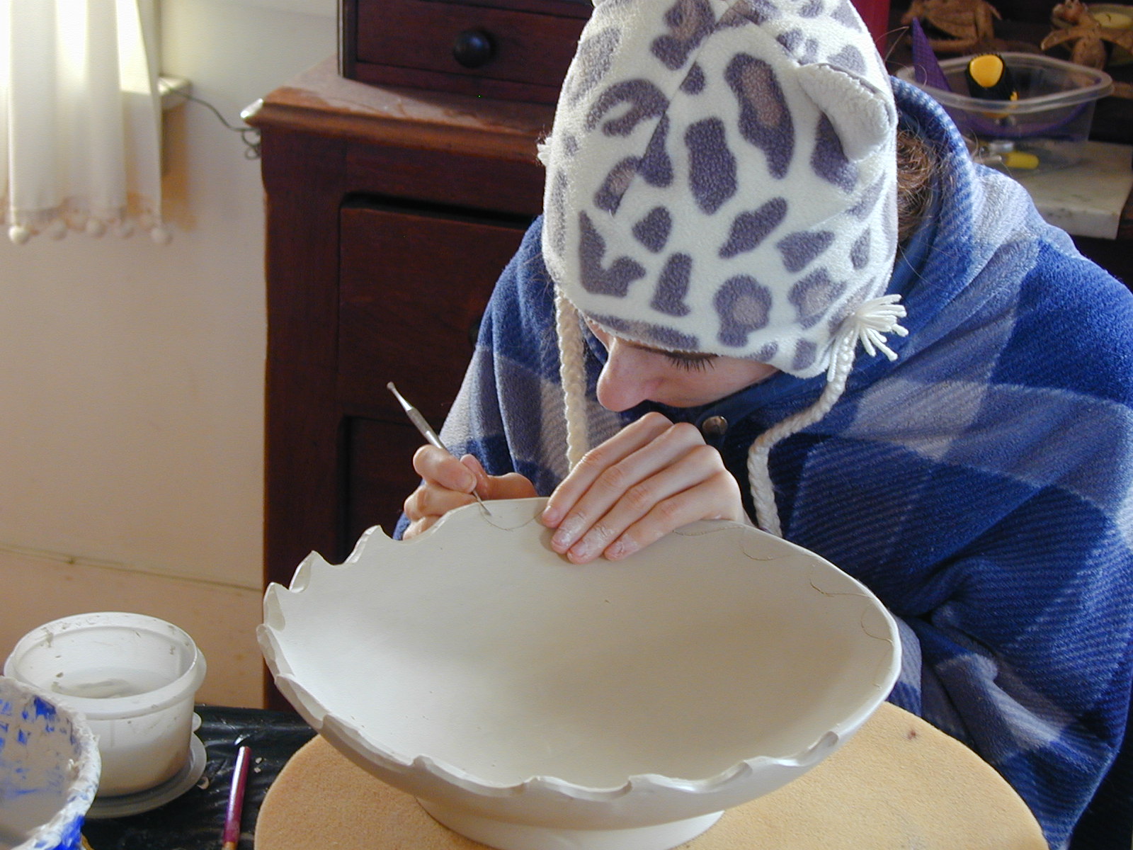
As I've been scrambling to get things done for the first holiday season Riverdragon Ceramics has ever had, I had Mr. Riverdragon take a couple of pictures to share. Here I am carving a custom-order bowl:

.JPG)
One advantage of working from home is that I get to wear a robe all day if I'm not throwing!
.JPG)
One advantage of working from home is that I get to wear a robe all day if I'm not throwing!
Friday, December 7, 2012
Riverdragon Ceramics gets a rave review!
Kimberly Wright, a fellow Etsy shop owner (link to her shop), has written a review of the work in my Etsy shop (link to my shop)!
To read the review, see her blog: http://kyleeinspiredcraftsgifts.blogspot.com/. Kimberly is posting daily reviews of Etsy artists and crafters through December, so do check back to her blog often and see what exciting things appear there! Thank you for featuring me, Kimberly!
To read the review, see her blog: http://kyleeinspiredcraftsgifts.blogspot.com/. Kimberly is posting daily reviews of Etsy artists and crafters through December, so do check back to her blog often and see what exciting things appear there! Thank you for featuring me, Kimberly!
Wednesday, December 5, 2012
Clay comparison
The red stoneware that I've been using is a mix that is no longer available called Dark Chocolate stoneware. It was a gift from another studio, where it had lain in a closet for a number of years, during which time the company that used to make it went out of business. So it is time for me to search out another nice cone 6 red stoneware.
I've been trying out a box of clay called Hawaiian Red. It's fairly different from the Dark Chocolate stoneware, and I'm not sure whether I like it or not. It has a lot of grog, so it was clearly intended to be used for handbuilding. I went ahead and started throwing pots with it anyway; grog usually doesn't bother me. But this stuff feels like sandpaper to throw. If I decide I like other aspects of this clay enough, I'd be willing to overcome my annoyance at how it feels to throw, but I'm undecided as of yet.
I was a little surprised at how different the Hawaiian Red looks when raw compared to the Dark Chocolate. They look fairly similar after being fired to cone 6. The orange bowls in this picture are the new clay, and the brown bowl is the old clay.

It even looks gritty after I've trimmed it, which is neat, but it also means I have to sharpen my trimming tools more often when working with it. We'll see what I think after I've tested some glazes on this stuff.
Subscribe to:
Posts (Atom)